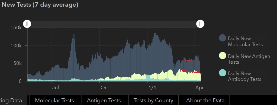
I saw this earlier on the Texas dashboard but didn't use it because the scale is large.
But since you posted it, if you look at the far right of the graph the dark blue has dropped indicating less molecular tests, from over approximately 60,000 test per day to about 40,000, the white indicating antigen tests drops, plateaus then drops again, indicating less antigen testing. the light blue is hard to scale but there is a dip about the same time as the others take their initial dip and then plateaus.
There are less tests being done since the beginning of April according to this graph as shown by the height difference between where the dotted line is to the end.
Note that testing dropped drastically in February, I believe it was when the power grid failed and test sites closed down.


