Steeles Royal

CBC report - Most Canadians don't think humans are the main cause of climate change

Frankfooter

dangling member
Apr 10, 2015
91,708
22,202
113
Because it only has 2 fucking years of projection you dumb fuck.
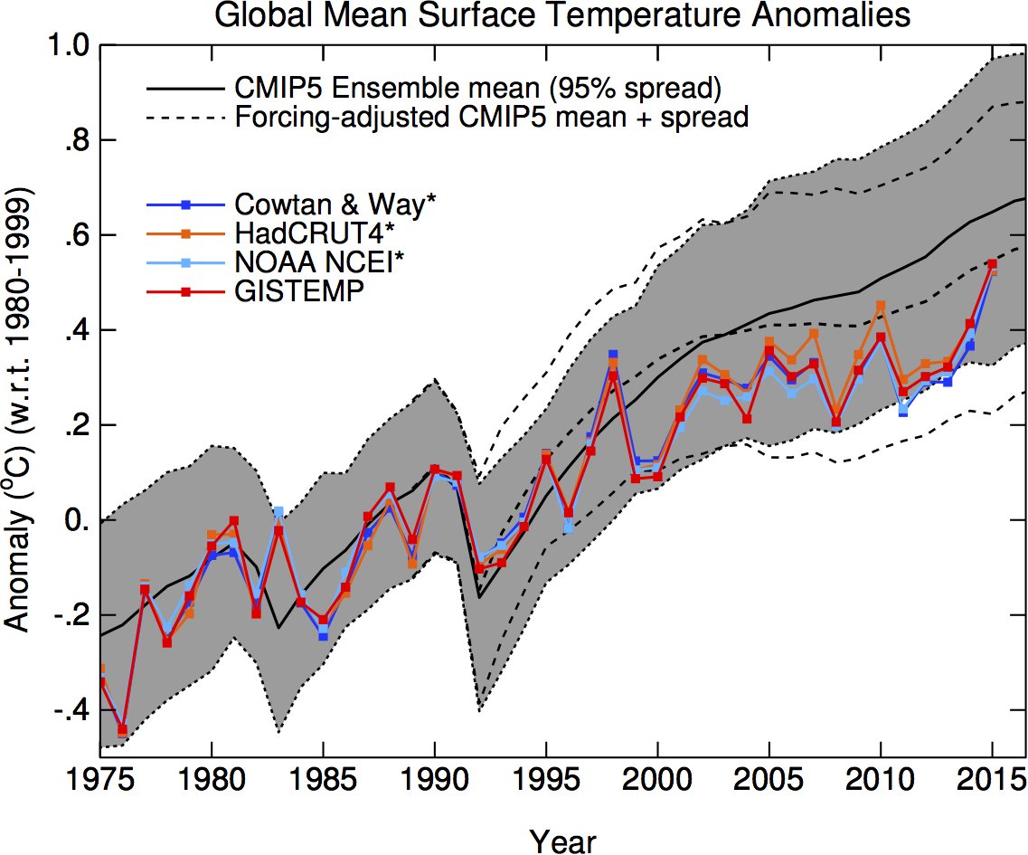
You whine that the projection is too recent when I post the recent data, then you whine when I post an older projection that shows accuracy over a longer period.
The older chart shows the projections are accurate, the newer projection shows you where we are headed.
Deal with it.
 

Moviefan-2

Court Jester
Oct 17, 2011
10,489
171
63
Typo's aside, have you taken the time to read the Nature article yet?
I believe that's what used to be known as a "Have you stopped beating your wife?" question.

I read the article before I posted it. It clearly states that there is a "significant" difference between what was observed and what was predicted (remember, there has been a huge increase in man-made CO2 emissions in recent years.)

The article confirmed what I have been saying all along.
 

Moviefan-2

Court Jester
Oct 17, 2011
10,489
171
63
There are things that can't predicted, like volcanoes, that are 'natural forcings'. Adjusting the projection for those shows the accuracy of the projection itself.
LMFAO!

So, you believe the predictions can be made to look not so bad -- after some "adjusting" to correct for the fact that the actual predictions were spectacularly wrong.

That's funny. This is why Frankfooter failed science.

Actually, I do agree with Frankfooter on one thing. There are things that can't be predicted, such as what impact -- if any -- man-made emissions are having on the Earth's temperature.

(And at the risk of sounding immodest, I met Frankfooter's challenge to prove his graph is "not accurate," even though Frankfooter never provided the source of the graph. :thumb:)
 

PornAddict

Active member
Aug 30, 2009
3,620
2
36
60
I watched the first minute and a half before I realized what nonsense that is, here's why:
1) Its a chart of mid-tropospheric temperatures - that's mid-atmosphere, while we mostly talk about surface temperatures
2) they accuse those who wrote the chart of 'cherry picking' the start date of 1978, which is idiotic. That data comes from satellite data that wasn't available before 1978, and its known to be less reliable then surface temperature.
3) he says the chart starts and ends near the same temperature, that is what is called 'cherry picking', and it ignores the averages of the chart that clearly show warming, and it also requires even more cherry picking because the real start and of the chart would also show warming.


Why is it that such basic flawed claims fool people?
You so full of shit like usual. This graph mid-atmosphere was presented by the
obama's science advisor Dr. Holdren during the white house presentation to the American people.
Obama Science Rick holdrem's chart picture was captured or freezed framed and they Pat & Stu analazyed and it show all the flaws and the lies that they the obama science adivisor's Dr Rick Holerem's did on the graph by manuipalating the angles of the graph and shorting the lines of the graph of the tracjetory of the begining and the ending of the graph and to make the tracjetory look more steeper the angle of acend raising alot worse which show more warming>

They obama science advsior presented this graph to the american people saying
that is the proof to the american people of global warming.
It not the so call global alarmist who presented this graph to the america people.

You can clearly see the title in the graph saying " whitehouse.gov in the monitor on top of the picture of the earth and next to the graph saying the mid-tropospheric temperatures ".
Bottom line they Obama Advisor's Dr Holdren (" global alarmist" ) presented and they manipulated and they got caught with
their lies.


PS The so callled climate denyier did not present this mid-atmosphere to the Amercian people.

YOU FRANKFOOTER ARE A FOOLS!

Pat&Stu took this graph from Obama's Science Adviser, Dr. Holdren, and completely blew it to pieces!
[/QUOTE]
 

Frankfooter

dangling member
Apr 10, 2015
91,708
22,202
113
You so full of shit like usual. This graph mid-atmosphere was presented by the
obama's science advisor Dr. Holdren during the white house presentation to the American people.
Obama Science Rick holdrem's chart picture was captured or freezed framed and they Pat & Stu analazyed and it show all the flaws and the lies that they the obama science adivisor's Dr Rick Holerem's did on the graph by manuipalating the angles of the graph and shorting the lines of the graph of the tracjetory of the begining and the ending of the graph and to make the tracjetory look more steeper the angle of acend raising alot worse which show more warming>
Look, if you can't raise a counter argument to the points I made, then all you're doing is repeating something you saw on youtube. Clearly you don't understand what you are talking about or you would be able to debate the points.
How can you take someone serious when they claim that the chart was made by 'cherry picking' dates when the chart starts when satellite data first became available?
Why are they basing their claims on less reliable mid atmospheric measurements instead of surface temperatures?

Those are basic points, why can't you answer them?
 

Frankfooter

dangling member
Apr 10, 2015
91,708
22,202
113
There are things that can't be predicted, such as what impact -- if any -- man-made emissions are having on the Earth's temperature.

(And at the risk of sounding immodest, I met Frankfooter's challenge to prove his graph is "not accurate," even though Frankfooter never provided the source of the graph. :thumb:)
According to you, these two things are equally as hard to predict?
1) how many volcanoes will erupt in a given period
2) what happens when you put a know amount of CO2 into the atmosphere

It takes a total lack of understanding to equate those two forcings.

The graph in question comes from Gavin Schmidt, I believe you were the first to link to his twitter account where he posts those charts.
https://en.wikipedia.org/wiki/Gavin_Schmidt
https://twitter.com/ClimateOfGavin/status/702558277918392321

His twitter page contains an excellent takedown of everything you've been claiming in one gif.

But even better is his talk on presenting data to people like you so that you can understand it.

He talks about the way Bloomberg presented all the forcings on climate, including all the 'natural variations' you claim are changing the climate instead of human actions.
Its an excellent graph, though the data only goes to 2005, Schmidt discusses the amount of data needed to make that chart as being a billion to 1 for the visualizations.
Contrast that with the lazy and faulty youtube video by pornaddict.

http://www.bloomberg.com/graphics/2015-whats-warming-the-world/
 

PornAddict

Active member
Aug 30, 2009
3,620
2
36
60
Look, if you can't raise a counter argument to the points I made, then all you're doing is repeating something you saw on youtube. Clearly you don't understand what you are talking about or you would be able to debate the points.
How can you take someone serious when they claim that the chart was made by 'cherry picking' dates when the chart starts when satellite data first became available?
Why are they basing their claims on less reliable mid atmospheric measurements instead of surface temperatures?

Those are basic points, why can't you answer them ?
Why don't you answer me why obama science advisor tilted the graph in the chart ? Answer why they
did omaba science Science Advisor's Dr Holdren adviser cherry pick end date differently Clearing anyone can read this chart in the video. Answer what is presented in the video!! Look at the end date with the temperature showing it the same temperature as the beginning date in the video.
Your obama science advisor Dr Holdern chosen this chart (mid atmospheric ) to present it as evidence in their case for global warming to the American people.
Or you fucking a stupid moron?? Clearly you. Fucking stupid moron!! Who supplied and who presented this chart to the American people during White House presentation as as proof to the american that the earth is warming up! This chart was presented by obama science advisor by Dr Holdern ..you cannot not rebuttal that point!! it proven to be manuinpulated!! Learn how to debate you moron!! Once you answer those question in the video and stop running and evading my point that was raised in the video then and only then i will answer your basic points!!

You a fucking stupid moron!!! By the way moviefan-2 won the bet and majority of terbite voted and the consensus is that you lost fair and square!! Honour the bet you loser!!

Pat&Stu took this graph from Obama's Science Adviser, Dr. Holdren, and completely blew it to pieces!

Bottom line they Obama Science Advisor's Dr Holdren (" global alarmist" ) presented and they manipulated and they got caught with their lies. And that is a fact clearly seen on the video presentation!!] Are you watching the same video i watching ...clearing you ignoring the flaw and the maniuplation that is proven by Pat & Stu that is show in the video!!
 

Moviefan-2

Court Jester
Oct 17, 2011
10,489
171
63
It takes a total lack of understanding to equate those two forcings.
You sure are knocking yourself out trying to change the subject.

The fact remains that the graph you repeatedly posted has been completely discredited. Sorry, but in the real world, scientists don't get to retroactively rewrite their predictions after they've seen the results.

Let's stick with the graph that showed the actual IPCC's predictions and the BBC report of the final anomaly (using the same 1961 to 1990 baseline).

IPCC prediction: 0.85ºC
Final 2015 anomaly: 0.75ºC.

Fact: 0.75ºC is less than 0.85ºC.

The IPCC's predictions remain consistently and spectacularly wrong.
 

Frankfooter

dangling member
Apr 10, 2015
91,708
22,202
113

Why don't you answer me why obama science advisor tilted the graph in the chart ?
'Tilted the graph'?
The chart in question was put in place by some graphic designer, I'm sure. The zero line has been put on an angle to make it appear to come from the planet.
So what?
Just because it confuses people like you doesn't make it dishonest.

Answer why they
did omaba science Science Advisor's Dr Holdren adviser cherry pick end date differently Clearing anyone can read this chart in the video.
How old is this video, 2014?
Satellite troposphere data started in '78 or '79, when the technology was invented.
I'm sure that's the chart they had on hand, otherwise they would have used more recent data which shows even more warming.
The only ones cherry picking are your weathermen.
Claiming it was cherry picking is just stupid.


Answer what is presented in the video!!
The rest of post is incomprehensable.
Why don't you look at the original video and tell me what you think is wrong, other then the incredibly stupid 'points' by your weathermen.


I already answered your questions, why can't you answer mine:

How can you take someone serious when they claim that the chart was made by 'cherry picking' dates when the chart starts when satellite data first became available?
Why are they basing their claims on less reliable mid atmospheric measurements instead of surface temperatures?
Where is the original version of this chart, without a link how can you prove that they didn't 'tilt the chart'?
Those are basic points, why can't you answer them?
Why do you fall for this crap?
Why are you wasting time with a white house press release video from 2 years ago?

Why don't you look at some real evidence.
http://www.bloomberg.com/graphics/2015-whats-warming-the-world/
 

Moviefan-2

Court Jester
Oct 17, 2011
10,489
171
63
Here's something rather interesting. It's the graph that appears in the paper by Fyfe, Mann and crew (which, by the way, includes the term "hiatus").


Page 225: http://www.nature.com/articles/ncli...trZLMnaUyec=&tracking_referrer=www.nature.com

What it clearly shows is that the temperature anomalies in the 21st century fell well short of the model-run predictions (the solid black line).

It also clearly refutes the NOAA's "pause buster" paper from last year.
 

Frankfooter

dangling member
Apr 10, 2015
91,708
22,202
113
Here's something rather interesting. It's the graph that appears in the paper by Fyfe, Mann and crew (which, by the way, includes the term "hiatus").

What it clearly shows is that the temperature anomalies in the 21st century fell well short of the model-run predictions (the solid black line).

It also clearly refutes the NOAA's "pause buster" paper from last year.
Fyfe's paper is a bit controversial, the finding's aren't yet confirmed and even their chart for CMIP vs reality look much different the the data coming out of NASA and most other sources.

This is a recent chart from Schmidt/NASA.


And again, here's an earlier chart from 2012 that shows natural forcings vs CMIP and reality, and it does show that aerosols and volcanic action are about enough to account for most of the differences between projections and reality.


From realclimate.com

Both of those charts look different, which makes me wonder why Fyfe picked RCP4.5 instead of 8.5, and what methods he went through in picking his CMIP simulations.
I'm sure that more will come out in the discussion post, but the main point comes from Fyfe's findings themselves.


it does not in any way undermine global-warming theory.
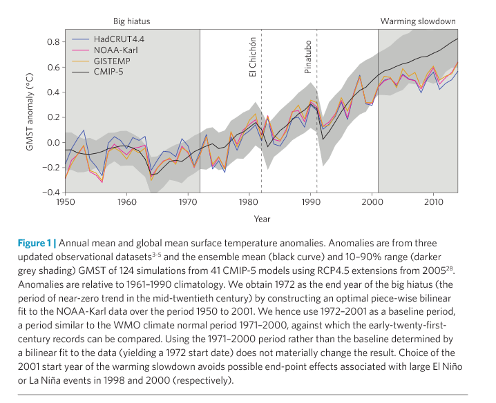
This statement calls into question moviefan's claims, as once again he is making claims that are contradicted by the authors.
 

Moviefan-2

Court Jester
Oct 17, 2011
10,489
171
63
Fyfe's paper is a bit controversial, the finding's aren't yet confirmed....
There's no doubt the findings are controversial.

However, it's important to remember that the Fyfe paper confirms what almost all of the research has shown in recent years. It was the Karl paper -- the so-called "pause buster" -- that was out of sync (and that had findings that even the Met Office and IPCC researchers were disputing).

In any event, whether there has been a hiatus or not, what remains clear is that the IPCC's predictions have been consistently and spectacularly wrong.
 

Frankfooter

dangling member
Apr 10, 2015
91,708
22,202
113
There's no doubt the findings are controversial.

However, it's important to remember that the Fyfe paper confirms what almost all of the research has shown in recent years. It was the Karl paper -- the so-called "pause buster" -- that was out of sync (and that had findings that even the Met Office and IPCC researchers were disputing).

In any event, whether there has been a hiatus or not, what remains clear is that the IPCC's predictions have been consistently and spectacularly wrong.
There you go going all Donald Trump again, you've called yourself a liar so often its ridiculous.
For example, as you previously said of IPCC projections:
The temperature anomalies fit within the range of the models.
You are calling yourself a liar.

And don't forget you lost a bet making this same claim.
We bet that the temperature anomaly would increase in 2015 to 0.83ºC
The bet was based on the IPCC's predictions of temperature increases of 0.2ºC per decade
Just as you also know that NASA reported the temp anomaly as 0.87ºC.

Its ridiculous you are still trying to make the same false claims after losing the bet on this issue.
 
Ashley Madison
Toronto Escorts