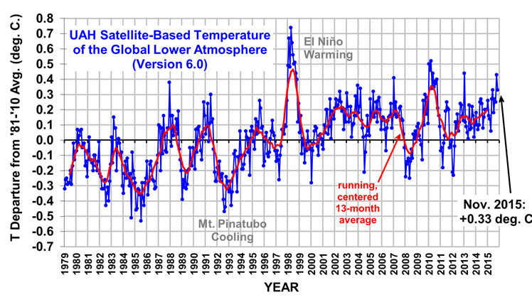
Nonsense. The HadCRUT4 graph that I posted is from Nov. 20, 2015: http://www.cru.uea.ac.uk/cru/data/temperature/Follow the link, this is the chart you are referring to.
Its more detailed and more up to date.
It is the most up-to-date graph available and it shows temperatures in the 21st century were stagnant prior to 2015.