I can see how that would be pretty heavy file size.
The artistic quality of the font is pretty good, for someone who had been dabbling with typography for about two months when it was made:

Screen cap from MSWord at 64 points.
The font works fine with Windows XP and Word 2000, but not very well with later versions of Windows or Word. If I live long enough, I might try to make a better version. I have better quality colour source graphics, and more skills.
I can't draw anything with pencil and paper, and I'm left-handed, but I draw with my right hand using a mouse on computer. I draw on top of photographs or artwork in two colours, composed for monochrome, (I used a different method back in 2007). The process is really slow, but the results I get are excellent.
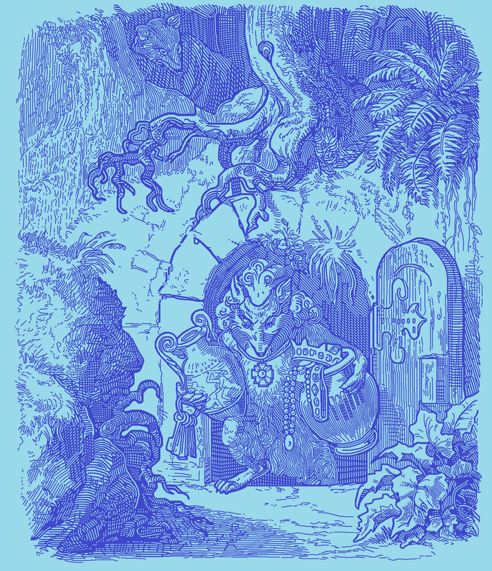
I'm currently attempting something which, as far as I know, has never been done before in vector art. I'm editing really large and complex artwork by Willhelm von Kaulback, illustrations from the book
Reinke Fuchs, (Reynard the Fox), by Goethe.
My source graphics are much too complex to imports into my font editor, so I plan to chop them into smaller pieces, import each piece separately, edit the 'raw' vectors, re-assemble the pieces, then shrink them to standard size for fonts in the '700 unit' range, which works out to almost exactly one inch tall in text at 72 points.
If this process is successful, I'll create font glyphs which look like mud at 72 points, but if the size is increased, they will literally 'explode' with detail.
The subject matter of this project isn't important, but the procedure is. I'm looking to demonstrate that "IT CAN BE DONE", and perhaps someone else might want to build on that, and streamline the procedure to make it faster. Using very 'clean' artwork on a white background would greatly reduce the time investment; I suspect that von Kaulback's illustrations may have been drawn in pencil, or they were originally considerably larger than the printed versions, and the paper stock for the scanned version had degraded in the 150 or so years between the printing and the scanning dates.
There's no money to be made from this project; it's just a hobby horse of mine to attempt to do something which hasn't been done before. The irony is that I would be producing something using obsolete technology which can't be replicated with the latest and most expensive font editing software.
ScanFont3 was made in the mid-1990's, and is no longer sold. It only works with Windows XP or earlier operating systems. My cracked version won't work with Windows XP after an update from January, 2014, so I make the fonts on a laptop custom prepared by my geek where he installed XP and Service Packs 1,2 and 3 only. This work computer has never been connected to the Internet since the operating system was installed. I move data files between computers with a USB drive.
I'm hoping that someone will develop modern software which could generate similar results. I have the means and the procedure to resize vector images, and I've done so successfully in the past. I can connect pieces of vectors in a font project using copy/ paste from one glyph frame to another I'll need to experiment a bit to try to connect pieces vertically; horizontally is easy. the solution might be to chop the source graphics into long thin pieces. I'm not sure if there is a maximum height for an imported monochrome bitmap to be translated into vector form. I know that the IS a maximum number of nodes, (points which connect line segments). Ideally I'd like to do all the vector editing at full size, including the recombination, but I may need to shrink them first before reconnecting them. I'm not at that stage yet.
I have two completed source graphics, (I worked on this a lot during COVID-19 lockdown, then abandoned the project for several years, before resuming recently). A third source graphic is almost ready, and I'll do my testing when it's finished.
Here's one huge completed source graphic, which will be reduced in size on TERB:
direct link to the full-sized image:
https://i.postimg.cc/W1Pd0Gnc/reinekefuchs00goet-0084-final.png (click on it to enlarge)
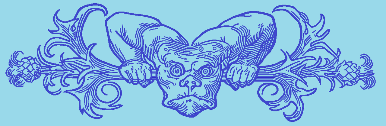
The other completed source:
Direct link:
https://i.postimg.cc/R0gL0SHL/reinekefuchs00goet-0079edit2-png.png
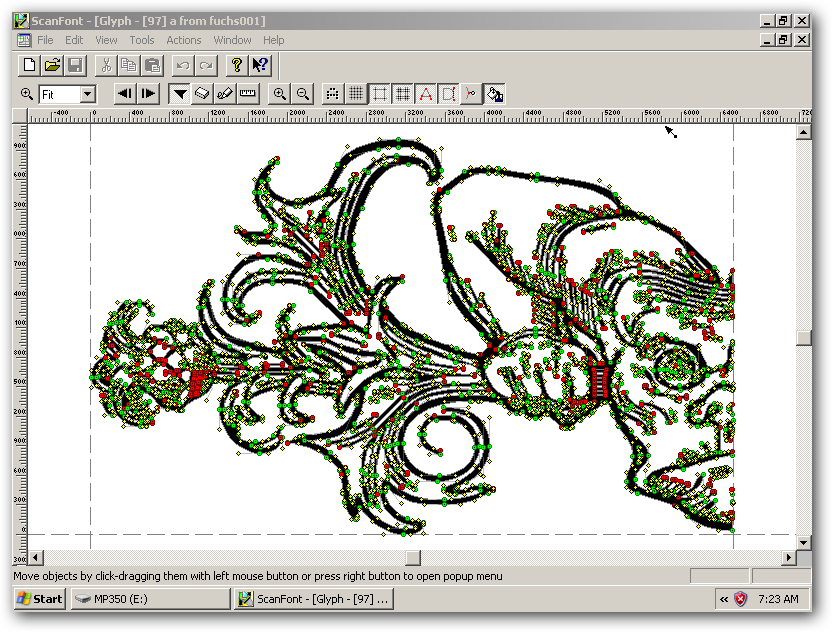
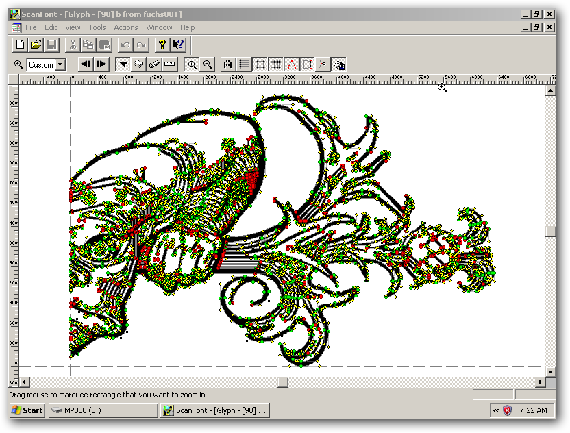
What this looks like in vector form, in two pieces, unedited:
Direct link:
https://i.postimg.cc/vZzWPY3G/fuchs1-raw-vector-1.png
Direct link:
https://i.postimg.cc/0y8SJgxc/fuchs1-raw-vector-2.png
Red, green and blue dots in the vector are nodes. Most of the vector editing involves removing extraneous nodes. It's a bit like playing Minesweeper, because the vector could collapse if I remove the wrong node, (edit -> undo restores the previous configuration). The yellow dots are control handles, they're used to determine the eccentricity and placement of curvature in a non-straight line segment.
While this may or may not interest you, you are perhaps among the minority of TERB members who could fully understand the above, and you may well be able to appreciate that this experiment could eventually yield practical merit, if not necessarily for me personally. One of MY ancestors didn't get any royalties for inventing the wheel.


