
I like that graph. It confirms the IPCC's predictions have been spectacularly wrong.Here's the graph you are still unable to read.
The one that shows how accurate the IPCC's projections are.


Study Finds That Corporate Funding Has Affected The Perception Of Climate Change
- Thread starter twizz
- Start date
You were caught lying about the results of two studies.Somebody should definitely feel embarrassed, but it's not me.
Repeatedly.
You lie repeatedly about the IPCC's projections and are in the process of losing a bet over the same issue, despite admitting that their projections are correct.
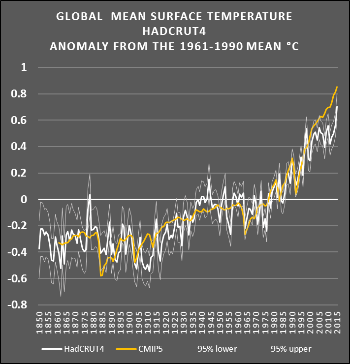
The temperature anomalies fit within the range of the models.
Right now the temperatures are 0.05ºC away from me winning the bet.That's because he knows the temperature at the end of 2015 won't be anywhere near what the IPCC predicted.
You should definitely be embarrassed.
Still can't read a graph, eh?I like that graph. It confirms the IPCC's predictions have been spectacularly wrong.
Hilarious. Here's the full quote of what I said.You lie repeatedly about the IPCC's projections and are in the process of losing a bet over the same issue, despite admitting that their projections are correct.
https://terb.cc/vbulletin/showthrea...rue-or-false&p=5349304&viewfull=1#post5349304Wrong.
The temperature anomalies fit within the range of the models. More specifically, the models that projected that huge increases in man-made greenhouse gases wouldn't lead to any significant warming were correct.
However, the IPCC's predictions -- such as the 2007 prediction of a 0.2 degrees C per decade increase -- were based on the average of the models.
The IPCC's predictions have been spectacularly wrong. The graphs confirm it:
National Post: http://financialpostbusiness.files.wordpress.com/2014/06/fe0617_climate_c_mf.jpeg?w=620&h=552
The Guardian: https://pbs.twimg.com/media/CIRz_2PVEAAf8QX.jpg:large
Apparently, Frankfooter thinks that when I said the IPCC's predictions have been "spectacularly wrong," I was somehow "admitting" that the IPCC got it right. :Eek:
It's no wonder someone so illiterate managed to convince himself that the "pre-industrial age" was 25 years ago. :biggrin1:
As far as the bet goes, there's no need to worry. I will win the bet.
I sure can.Still can't read a graph, eh?
According to your graph, the number of times that the white line intersects with the gold line in the 21st century: Zero.
That means the IPCC's predictions have been spectacularly wrong.
Cherry picking, your usual answer.I sure can.
According to your graph, the number of times that the white line intersects with the gold line in the 21st century: Zero.
That means the IPCC's predictions have been spectacularly wrong.
And its wrong to boot.
2015 is the intersection of your 'gold and white' lines on that chart, with today's temperatures right on the projection.
I love that you post two charts that prove that the projections are accurate, as soon as you add in this years data.Hilarious. Here's the full quote of what I said.
.
http://www.cru.uea.ac.uk/cru/data/temperature/HadCRUT4-gl.dat
Your arguments are old and out of date, just like you.
You're delusional. The two lines don't intersect at all in the 21st century, including in 2015.2015 is the intersection of your 'gold and white' lines on that chart, with today's temperatures right on the projection.
I'm guessing you don't know what the word "intersect" means.
The graph confirms the IPCC's predictions have been spectacularly wrong. Thanks for posting it.
According to your graph, this year's data show the predictions continue to be wrong.I love that you post two charts that prove that the projections are accurate, as soon as you add in this years data.
NOAA puts the 2015 year to date anomaly at 0.86ºCAccording to your graph, this year's data show the predictions continue to be wrong.
https://www.ncdc.noaa.gov/cag/time-series/global/globe/land_ocean/ytd/10/1880-2015
Place that in the chart below and its deadly accurate, only a fool either can't enter that data point or does so and finds it 'wrong'.
$4B per year funds the AGW side of the debate.There was about half a billion in money funnelled into denier lobbyists over about a decade.
http://www.scientificamerican.com/article/dark-money-funds-climate-change-denial-effort/
The side of science spends money on research, but its not allowed to spend it on anything other then research, for the most part.
OMG! Where did you learn how to plot numbers on a graph -- from Basketcase?NOAA puts the 2015 year to date anomaly at 0.86ºC
Rather than mixing and matching numbers from different data sets that are using completely different baselines, how about sticking with the HadCRUT4 data that has actually been plotted on your graph. It shows the temperature anomaly for 2015 to be well below what the IPCC predicted, even in this strong El Nino year.
Your graph confirms it -- the IPCC's predictions have been spectacularly wrong.
Hadcrut4 lags behind one month in its reports, NOAA is more recent.OMG! Where did you learn how to plot numbers on a graph -- from Basketcase?
Rather than mixing and matching numbers from different data sets that are using completely different baselines, how about sticking with the HadCRUT4 data that has actually been plotted on your graph. It shows the temperature anomaly for 2015 to be well below what the IPCC predicted, even in this strong El Nino year.
Your graph confirms it -- the IPCC's predictions have been spectacularly wrong.
Hadcrut4 also uses sea surface temperatures in their calculations, which put them a little lower then NOAA and others that use air temps over seas, which is why you only like to refer to that data set, I expect.
My preference is NOAA and NASA, they are updated quickly and provide terb handy charts.
Our bet is off of the NASA numbers, which are very similar to the NOAA numbers.
The chart I've been using from hotwhopper.com uses HadCrut4, but it at least includes the year to date.
But for your benefit, the number I've read for the year to date for Hadcrut4 is 0.79ºC, lower then NOAA's 0.86ºC, but not too far off considering its also a month behind.
Up until Sept the HadCrut4 anomaly is 0.79ºC, which puts it just below your gold line, and when Oct's data comes out I expect it will be even closer.
And stick in the numbers from NOAA, NASA and Hadcrut4 in the IPCC 2013 projection and you'll find they look very, very accurate.
So, now you're claiming that the graph that you have been repeatedly posting is completely wrong.Up until Sept the HadCrut4 anomaly is 0.79ºC, which puts it just below your gold line, and when Oct's data comes out I expect it will be even closer.

In fact, the 0.79ºC anomaly in the Bob Tisdale graph that you're now citing is for the single month of September, not for the year to date.
http://wattsupwiththat.com/2015/11/...erature-anomaly-model-data-difference-update/
Here's the Bob Tisdale graph that actually compares the HadCRUT4 data with the predictions. The current anomalies are nowhere near what was predicted.

In Mr. Tisdale's own words: "It’s very hard to overlook the fact that, over the past decade, climate models are simulating way too much warming and are diverging rapidly from reality."
The HadCRUT4 total for the year (including the updated data for October 2015) is 0.71ºC, as was depicted on your previous graph -- nowhere near what the IPCC predicted: http://www.cru.uea.ac.uk/cru/data/temperature/HadCRUT4.pdf
Your own data and graph confirm that the IPCC's predictions have been spectacularly wrong, as I have been saying all along.
That chart is correct, it just hasn't been updated.So, now you're claiming that the chart that you have been repeatedly posting is completely wrong.
Ok, I made a mistake, apologies.
The year to date for Hadcrut4.4.0 is 0.713ºC, posted here in column 2.
http://www.metoffice.gov.uk/hadobs/...time_series/HadCRUT.4.4.0.0.annual_ns_avg.txt
The Hadcrut numbers are lower then NOAA and NASA in general, since they include sea surface temperature while the others do air temperatures.
From now on I'll just source out the NOAA and NASA numbers, they appear to be more accurate and use a better metric, as well as publishing their data in clearer forms.
Yup. That's what it showed in the graph you initially posted. And the 2015 anomaly is nowhere near what the IPCC predicted, as your graph also shows.Ok, I made a mistake, apologies.
The year to date for Hadcrut4.4.0 is 0.713ºC, posted here in column 2.
http://www.metoffice.gov.uk/hadobs/...time_series/HadCRUT.4.4.0.0.annual_ns_avg.txt
The IPCC's predictions have been spectacularly wrong.
You really don't know what you're talking about. They all include sea surface temperatures.The Hadcrut numbers are lower then NOAA and NASA in general, since they include sea surface temperature while the others do air temperatures.
The difference is they use different baselines as their starting point for comparing the anomalies.
Yup, you are correct, I made two mistakes in one day.You really don't know what you're talking about. They all include sea surface temperatures.
The difference is they use different baselines as their starting point for comparing the anomalies.
As stated on the other thread, was perusing a bob tisdale post and forgot who I was reading.
I should know better then to let that shit get by me, shouldn't I?
You keep saying that, but the chart shows you wrong, and you've even admitted that you are wrong.Yup. That's what it showed in the graph you initially posted. And the 2015 anomaly is nowhere near what the IPCC predicted, as your graph also shows.
The IPCC's predictions have been spectacularly wrong.
The temperature anomalies fit within the range of the models.
Perhaps you should take another look at the graph that you provided in post #38, #46 #50, and countless other places.You keep saying that, but the chart shows you wrong...
It's your graph. It has up-to-date data. And it clearly shows the IPCC's predictions have been spectacularly wrong.

